2021 Color Trends: Taking us back to our earthy roots
- Tiger Oak Designs
- Oct 26, 2020
- 4 min read
2020 has been a wild year, and quite frankly, I couldn't be more excited to have written 2021! It seems like everyone is looking forward to bidding 2020 adieu, and paint manufacturers are no exception. With everyone scrambling to figure out how to restore calm and order to the chaotic year we've had, every paint brand seemed to have the same idea in mind ... rich, earthy, saturated tones that ground us and bring us back to our earthy roots. Nature has a restorative effect on our mental, physical and spiritual well-being, so it's no wonder that these earthy, sunbaked tones are the colors we want enveloping us in our homes as we enter the new year.
Joa Studholme, Colour Curator at Farrow and Ball, said it perfectly when she described their 2021 palette as, "strong and subdued yet achingly fashionable. Chic by day and cozy by night, [these colors provide a] grounded but luxurious atmosphere.” A far cry from the whites and grays we're used to seeing in homes, these chocolatey browns and clay reds invite us to settle in and recharge.
SHERWIN WILLIAMS - 2021 COLOR OF THE YEAR: URBANE BRONZE

A dark, warm neutral, this sophisticated brown with grey undertones can be used in almost any space, either as a bold accent or enveloping the entire room for a truly cozy feeling. Paired with organic, textural elements such as leathers, woven materials and wool, this earthy brown is a welcoming, dark neutral for those who are afraid of dark colors. “Urbane bronze encourages you to create a sanctuary space for mindful reflection and renewal.” – Sue Wadden, Director of Color Marketing for Sherwin Williams.


BENJAMIN MOORE - 2021 COLOR OF THE YEAR: AEGEAN TEAL

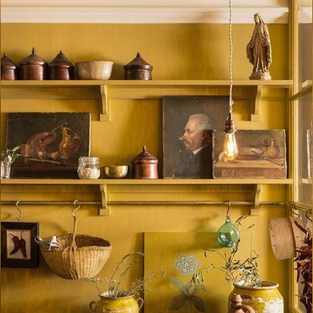
Benjamin Moore's 2021 color trend palette was equally inspired by Mother Nature. "We were gravitating towards colors that had this organic, natural rooted sensibility,” - Andrea Magno, Director of Color, Marketing and Development for Benjamin Moore. "It has a presence and personality – you’re drawn to it." said Magno, in reference to Aegean Teal, their 2021 color of the year. "It has that soothing feeling that we’re looking for; it’s uplifting.” Aegean Teal is a calming blue-green that acts as a bridge between warm and cool colors. Since blue typically reads on the cooler side of things, they really work their magic in southern-facing rooms because they help balance the strong, warm southern light. I love the way they paired this soft, muted blue in the kitchen, along side the warm copper lights and gold accents. In smaller doses, this blue could really stand out as an accent on built-ins, as well as on a kitchen island.


Bookcase featuring Amazon Soil and Rosy Peach via Benjamin Moore
FARROW & BALL - 2021 COLOR OF THE YEAR: PREFERENCE RED

Farrow & Ball has a long history steeped in choosing (and naming) their colors from the world around us. F&B is one of my favorite paints to use because of the unique ways their colors change throughout the day. In the 1970's, many paint brands began creating acrylic paints with less pigments and added plastic fillers. Farrow & Ball continues to use its original recipes and age-old methods, using plenty of rich pigments and generous amounts of light-reflecting titanium dioxide. This ensures that the various undertones in the paint stand out at different times of the day depending on the quality of light.
They broke their palette into 4 moods, beginning with a timely, autumnal selection of earthy reds and warm browns. “Luxurious colors like Preference Red can be added to the most neutral of palettes by using them in rooms we use at the end of the day, when we most want to relax and be comforted.” said Joa Studholme. They will also look great on shelving. Their second mood is a selection of clean and timeless blues. According to Joa, “these uncomplicated shades feel familiar, like memories from our childhood, [and] have a soothing effect in the home despite their cooler undertones." Blue always looks at home in a kitchen, and when paired with white, especially in a dining room, can feel more formal and traditional.


Tanner's Brown, Stiffkey Blue and Pitch Blue via Farrow and Ball
Farrow & Ball's third mood is a beautiful palette of soothing, natural greens. Rugged and earthy, these soft greens forge a deeper connection to nature within our homes, and cultivate a tranquil feeling ... something we are all in need of these days! Their final mood is what Joa describes as 'earth colors' ... aged neutrals that are easily layered yet have a warm, moody quality to them. Jitney is a perfect base color to build upon, while India Yellow is a mix of aged ease and modern strength.


Sap Green, Jitney and India Yellow via Farrow and Ball
Whatever color you choose, these saturated, earthy tones are no-fail options. Grounded in nature, they are subtle enough to introduce into your home without overpowering it, yet also rich enough to feel upscale and posh. I hope you've found some color inspiration that will help make 2021 your coziest year yet! If you still need help, contact Tiger Oak and ask about my color consultation service... I would love to help you on your color journey!
xx- Natalie
"When your home shows up well for you, you can show up well for others"


https://j88.jp.net/ mình bấm vào thử cho biết thôi vì thấy bạn bè hay nhắc, kiểu xem giao diện có dễ dùng không. Vừa vào là thấy họ trình bày khá thoáng, chữ không bị dồn dập nên đọc lướt cũng hiểu đang nói gì. Phần giới thiệu viết theo kiểu thẳng thắn, nhắc chuyện hoạt động lâu năm và hướng tới sân chơi “sòng phẳng”, đọc không có cảm giác màu mè. Mình thích nhất là mấy khối nội dung được chia rõ ràng, cuộn xuống vẫn theo mạch nên không bị rối. Menu cũng đặt ngay ngắn, bấm qua lại nhanh, nhìn là biết từng nhóm mục nằm ở đâu trên trang.
U8888 mình thấy xuất hiện hoài trên mấy bài giải trí nên tò mò bấm vào coi thử, chủ yếu xem giao diện chứ không có ngồi chơi gì. Ấn tượng đầu là trang chia mục nhìn khá rõ ràng, kiểu từng khối nội dung tách bạch nên lướt nhanh vẫn nắm được mình đang ở đâu. Mình thích nhất là phần menu đặt ngay chỗ dễ thấy, bấm qua lại giữa các mục không bị vòng vo hay phải tìm lâu. Màu sắc với chữ cũng vừa phải, không nhồi nhét quá nhiều thứ trên một màn hình nên nhìn đỡ mệt mắt. Nói chung cảm giác dùng kiểu “vào là hiểu”, không cần đọc hướng dẫn gì nhiều,…
fly888 mình thấy xuất hiện hoài trên mấy bài về giải trí online nên tò mò bấm vào xem thử giao diện thế nào. Mình không có ngồi soi từng trò hay gì, chủ yếu xem cách họ sắp xếp thông tin cho dễ dùng không. Ấn tượng đầu là trang nhìn khá thoáng, chữ nghĩa rõ ràng, mấy khối nội dung chia ra gọn nên kéo xuống không bị ngợp. Có điểm mình thích là họ để sẵn tiếng Việt nên thao tác nhanh, không phải đoán mấy mục linh tinh. Mấy phần giới thiệu nhận diện thương hiệu cũng đặt khá ngay ngắn kiểu bảng thông tin, đọc lướt là hiểu họ đang hướng tới người chơi Việt.…
NET88 COM mình mới ghé thử vì thấy nhiều người nhắc, chủ yếu tò mò giao diện và cách họ sắp xếp nội dung thôi. Ấn tượng đầu là trang nhìn khá gọn, chữ nghĩa rõ ràng, không bị nhồi nhét quá nhiều thứ một lúc nên lướt cũng đỡ mệt. Mình có để ý họ nói khá nhiều về hướng “minh bạch & bảo mật”, kiểu nhấn mạnh chuyện dữ liệu và cơ chế giám sát, đọc qua thấy yên tâm hơn chút dù mình không đào sâu. Mấy khối nội dung trên trang được chia theo từng mục, nhìn phát biết đang ở phần nào, kéo xuống cũng không bị lạc. Menu để ngay chỗ dễ thấy, bấm…
luck8 dạo này thấy nhiều người nhắc nên mình cũng vào xem thử cho biết thôi. Ấn tượng đầu là trang chủ nhìn khá gọn, kiểu chia nội dung theo từng khối nên kéo xuống không bị rối mắt. Mình không có ngồi soi từng trò hay gì, chủ yếu xem họ sắp xếp thông tin thế nào để người mới đỡ lạc. Thấy có phần hướng dẫn “xổ số siêu tốc” đặt tiêu đề khá to, đọc lướt cũng hiểu họ đang nói gì mà không cần bấm nhiều. Tổng thể giao diện nhìn hiện đại, chữ dễ đọc, mấy mục chính nằm rõ ràng nên tìm cái mình cần cũng nhanh. Nói chung mình thích kiểu trình bày…