What the 2020 NYFW runway has to say about interior design trends
- Tiger Oak Designs
- Feb 25, 2020
- 4 min read
Updated: Aug 23, 2020

It should come as no surprise that fashion and interior design have always been connected. Most notably, they are both ways in which we can express ourselves as individuals. Historically, the runways of New York and Paris were only accessible to the most affluent, and it would take considerable time for craftsmen to distill the trends into a consumable product. But with advances in technologies like mass-production as well as the internet, we can just hop on Instagram and see highlights of the shows - sometimes in real-time! Now, no one is suggesting you replace your sofa as often as you change out your favorite pair of jeans, but if you find something you are loving on the runway, chances are there is already a textile designer replicating the same motifs and a furniture designer ready to use it. Let's take a look at 5 of the hottest trends coming off the runways at this year's New York Fashion Week, and how we can expect them to show up as home decor trends ...
FLORALS
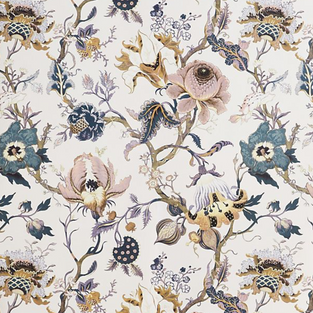
Nearly all of the designers featured at NYFW had one thing in common ... florals. From vibrant blossoms to muted, iridescent gowns, nature's confetti was everywhere. What does that mean for us? Get ready to see floral textiles make a big splash in every finish, from upholstery, pillows and draperies, to wallpapers, finials, light fixtures and hardware. Nothing cheers up a room more than a vase of fresh cut flowers, so don't be afraid to incorporate the motif into more lasting items. Here are a few examples of my favorite floral-inspired home decor items ...
PLAID
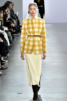
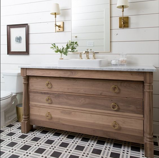
Madras, Tartan, Windowpane ... you name it - plaid was a common theme on the runway again this year. Some designers kept with the menswear approach, and others brightened it up in pinks, yellows and greens. In the home, plaid has traditionally worked well on accent pieces, such as pillows and throw blankets, but it can also work on larger scale items like couches and chairs when done thoughtfully. If you're not a fan of the Scottish highland feel the pattern can evoke in a room, try thinking outside the box and consider wallpaper or floor tiles! Here are a few of my favorite, more modern uses of the pattern ...
RED
- Red was a theme we saw a lot on this year's runway. It is also a color many people seem intimidated by when considering it for their home. Red definitely adds drama, so a little goes a long way. I always like pairing red with either neutrals or cool blue and white rooms, to avoid it feeling too "primary school". A pair of red accent chairs in an otherwise neutral room is a great way to add personality, and a red rug (especially vintage) adds a depth and warmth that few other colors could achieve. For the extremely timid, try adding a red lamp to an end table or a red vase in a room. Just a few pops of red here and there can really be all that you need. Here are a few great examples of how using red in a thoughtful manner can really make your space ...
METALLICS AND FRINGE
It wouldn't be the Roaring 2020's without some flapperesque fringe, right? I am so excited to see this making a comeback. While fringe can definitely read "western", when done in bold, unexpected colors or metallic neutrals, it creates a really modern look that adds a lot of dimension to a room. If you're looking for more of a bohemian feel, go for fringes in natural fibers, like wool. Metallics were also a big look on this year's runway. I love mixing metals in a room, especially in a kitchen or bathroom, where you can use different metals on hardware as well as sink taps, etc. If you're really daring, there are some stunning metallic wallpapers on the market. While using them in a living room might be too much for most people, a place like a powder bath or closet are great places to stretch your comfort zone! Here are a few of my favorite metallics and fringe accessories (including one of my all-time favorite pendants!) ...
WARM NEUTRALS
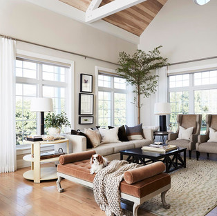
Warm whites, caramels and taupes were all over the runways this year. I think this decade will be one of transitioning away from the grey grey grey we've covered our homes in for the past 10 years, and re-embracing the warmer taupes of the 90's and early 2000's, but in a fresh, updated manner. Look for marbles with brown veining to start replacing the calacattas, and the stark white kitchens to use more natural wood tones and creamy whites. White oak has always been a favorite of mine, and is increasingly more on-trend. Farrow and Ball have a great lineup of what they call "traditional neutrals" which are excellent paint choices. Their use of pure pigments allow their paints to have so much more depth to them than the more typical paint brands of Benjamin Moore or Sherwin Williams. Here are some great options if you're looking for inspiration to get you out of your "grey walls, white kitchen" rut ...
New York Fashion Week is always a favorite of mine, as I love seeing how the designs evolve from one season to the next. Just as our lives evolve with each new season, our homes should as well, so if you've found yourself at the stage where you're ready to make some big changes, why not be daring and be on the forefront of this new wave. Or, if you're like me, and you're still swimming in pre-school toys and play-doh, a new coat of paint and updated kitchen pendants might be enough to get us over the hump! Whatever season you're currently in, make sure your home is reflective of who you are and where you're going.
xx- Natalie
"When your home shows up well for you, you can show up well for others"















Comments